Hotel Seidenhof ****

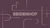
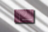
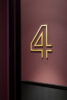
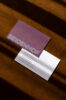
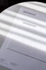
The rebirth of a Zurich icon

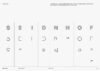
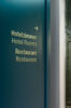
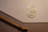
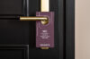
Sorell Hotels renovated their four-star hotel Seidenhof, situated right next to the iconic Bahnhofstrasse. In doing so, they aimed at turning one of Zurich’s oldest houses into their prime landmark. To achieve this, we created a visual identity which pays homage to the location’s architecture and history, while at the same time firmly anchoring it in the present. In reference to its legacy as a former silk mill and the building’s prominent Art Deco architecture, we conceived a brand which not only exhibits a rich heritage, but also establishes Seidenhof as a contemporary meeting point in the heart of Zurich.

Skala_Hotel Seidenhof ****_3

The main brand element is a bespoke word mark consisting of geometric, contoured shapes. It is inspired by typefaces from the Art Deco period and the strong vertical lines of the Seidenhof front. By opening up the letters and revealing a free space between their defining lines, the meaning of the name ‘Seidenhof’ (German, literally translated: ‘silk yard’) is illustrated. References to silk threads and cloths as well as to new spaces for staying, meeting and living are drawn.

Skala_Hotel Seidenhof ****_3

The separated shapes of the word mark act as the main components of the secondary design element: a moving pattern. Built on a strict grid, the pattern is reminiscent of a city map and evokes the idea of a dynamic meeting point.

Skala_Hotel Seidenhof ****_3

To complement the geometric yet neo-grotesque word mark, the typeface ‘Selecta’ is used across all brand and signage elements. The colors and materials used throughout the visual identity are refined to harmonize with the building’s interior. They fit the specific needs of both digital and print applications.

Skala_Hotel Seidenhof ****_3

In addition to the new brand language, we conceptualized the hotel’s signage. For this, we extended the custom typeface of the word mark with numeral figures to signal floors, while using ‘Selecta’ for more discreet information. By using materials that seamlessly blend with the interior, a holistic sense of space and identity is achieved.

Skala_Hotel Seidenhof ****_3

For further branding case studies, visit our archive →.