Creative Week 2019

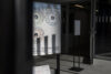
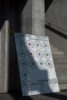
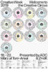
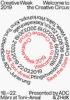
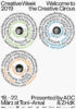
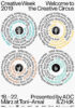
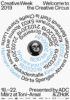
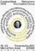
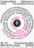
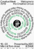
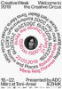
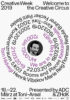
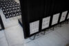
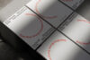
Setting the stage for the ‘Creative Circus’

The Creative Week is an annual event for the Swiss creative industry organized by the Art Directors Club Switzerland (ADC). It hosts workshops and talks by internationally renowned professionals and a national award show. The organizational committee tasked Skala with the design of the visual identity for the 2019 edition. ‘Welcome to the Creative Circus’ was the event’s guiding motto, highlighting the diversity and uniqueness of its speakers and celebrating the sometimes chaotic nature of the creative process. As the event is targeted at creatives from all over the world, the design had to be bold but sophisticated. We therefore created a visual identity which is characterized by a strong typographic concept and reflects the lively nature of creativity.

Skala_Creative Week 2019_3

Refering to a circus ring, we created a system based on rotating circles. The resulting visual identity supports the event’s goal of serving as a melting point of the creative industry. It gives each artist its own stage. By assigning different functions to all circle layers, a clock-like program is created for each day of the event. The emerging typographic compositions symbolize rhythms of applause in an arena. The individual informations are highlighted are highlighted in color to give each speaker a unique stage.

Skala_Creative Week 2019_3

The key visual (the typographic circus ring) was applied in various ways to create posters for each speaker and each day of the event. Furthermore, a timetable was made and animations were deduced for digital media to set the circus rings into motion.

Skala_Creative Week 2019_3

The typeface ‘Sneak’ with its round dots and ironic upside-down letters lends itself well for circular use. Typographic details were curated to improve legibility and strengthen the conceptual system.

Skala_Creative Week 2019_3

For further visual identity case studies, visit our archive →.